

Does your brand look good but still feel forgettable? Many founders struggle with creating visuals that people instantly recognize and remember. The problem is rarely the logo itself. More often, it is the lack of a complete visual world that brings the brand to life.
A successful lifestyle brand sells more than products. It sells a feeling, an aspiration, and a way of living. When your visuals consistently communicate that feeling, people begin to connect with your brand on a deeper level.
This guide will show you how lifestyle brands visual identity systems are built. You will learn practical methods to create a cohesive visual world that feels authentic, memorable, and consistent across every customer touchpoint.
Why Is a Visual Identity System More Important Than a Logo?
Many business owners believe their logo is the foundation of brand recognition. While a logo matters, it is only one piece of a much larger system. Customers remember experiences, emotions, and visual consistency far more than a single symbol.
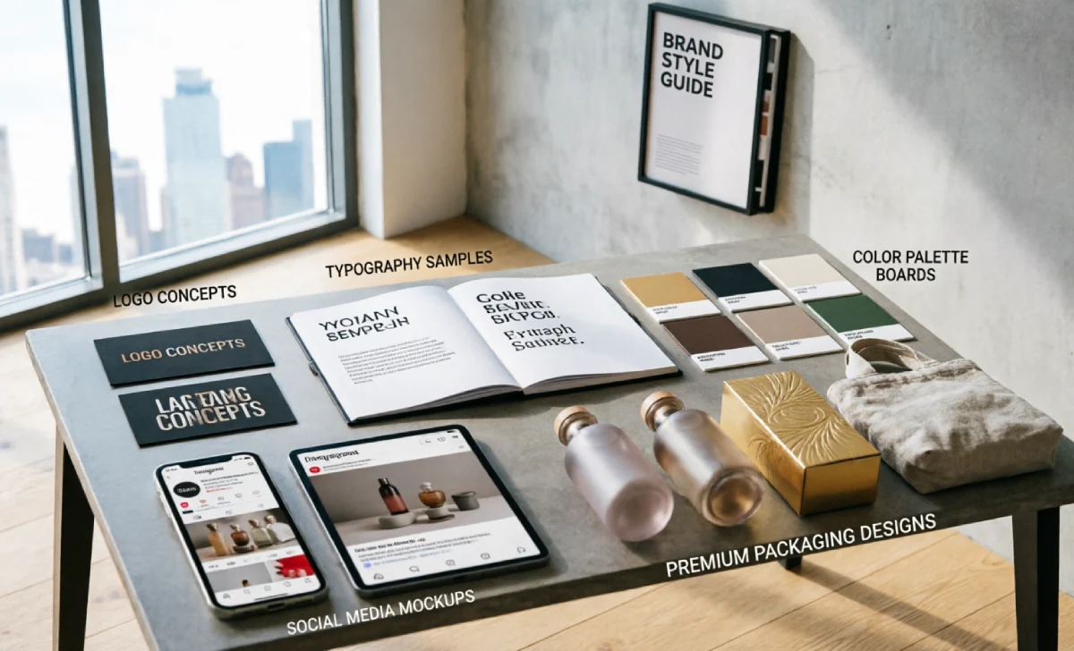
A visual identity system includes your typography, color palette, imagery style, textures, composition, and creative direction. Together, these elements create a recognizable visual language that customers learn to associate with your brand.
Think about your favorite lifestyle brands. You could probably recognize their social posts, product pages, or advertisements even if the logo disappeared. That recognition comes from a consistent visual system.
Building a strong visual identity also requires solid business planning. Many founders start by defining their brand structure using a business model canvas before translating those ideas into visual elements.
Your visual identity should support your brand values at every stage. Every design choice should reinforce the message you want customers to remember.
How Do You Create an Emotional Register Through Visual Storytelling?
People often buy based on emotion before they justify their decision with logic. That is why visual storytelling plays such a critical role in lifestyle branding.
Visual storytelling means creating scenes that communicate a specific feeling. Instead of simply displaying a product, you show how that product fits into a desirable lifestyle.
For example, a luxury candle placed inside a warm apartment surrounded by books creates a completely different emotional response than the same candle sitting on a plain white background.
The goal is to build what designers call an emotional register. This is the emotional atmosphere customers experience whenever they interact with your brand.
You should begin by identifying the emotions you want people to feel. Do you want your audience to feel calm, adventurous, confident, creative, or sophisticated? Your imagery should consistently support that emotional goal.
When every visual reinforces the same feeling, customers begin associating those emotions with your brand. That emotional connection often becomes a major driver of long-term loyalty.
The Role of Material Palettes in Lifestyle Branding
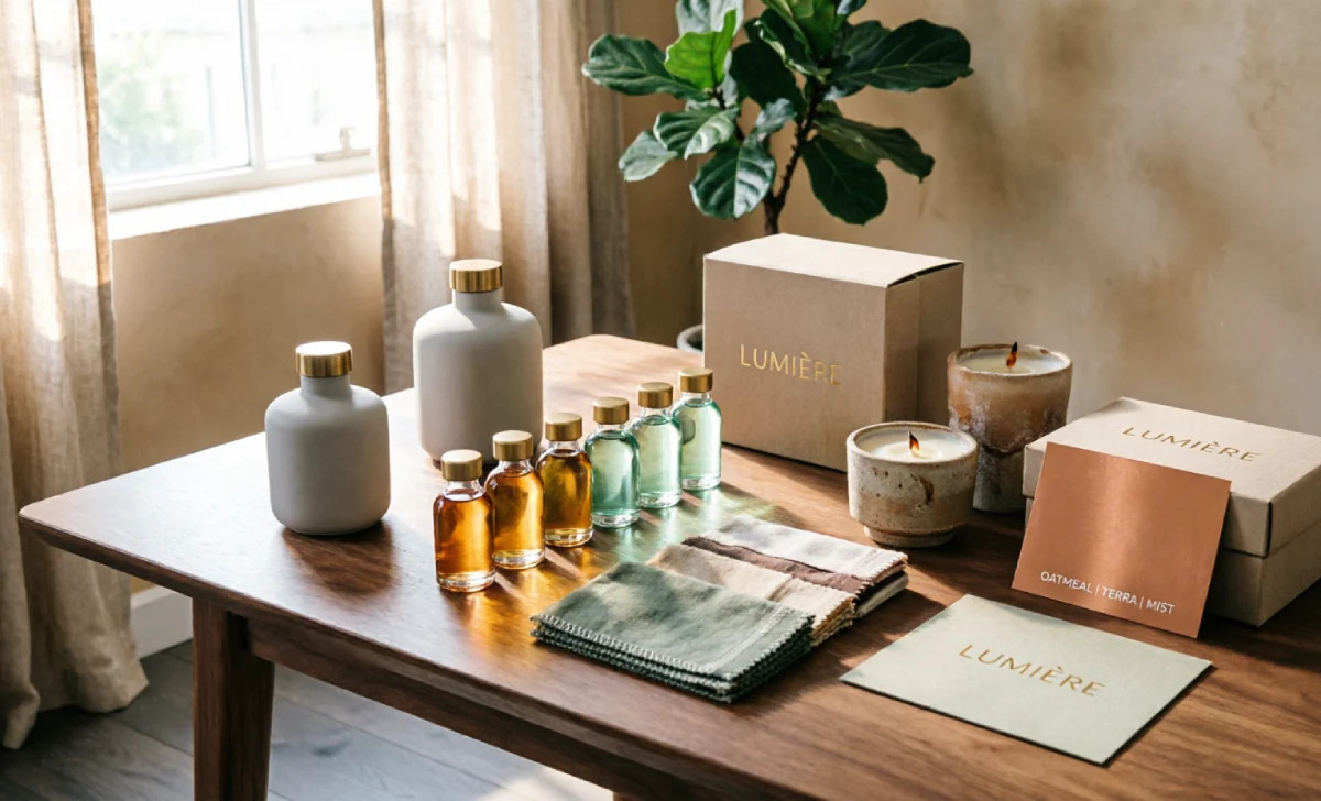
One of the most overlooked aspects of lifestyle brands’ visual identity is the material palette. A material palette refers to the surfaces, textures, and physical materials that repeatedly appear throughout your visual content.
These materials communicate meaning even when no words are present. Different textures create different impressions in the minds of consumers.
For example, raw concrete, brushed steel, and glass often communicate modernity and precision. Meanwhile, linen, wood, aged marble, and handmade ceramics tend to suggest warmth, comfort, and authenticity.
Imagine placing the same product in two different environments. One sits on a polished steel surface under bright lighting. The other rests on a rustic wooden table near a window. The product remains identical, but the perceived brand personality changes dramatically.
Consistency matters here. Repeating the same materials across product photography, campaigns, packaging, and social media helps strengthen visual coherence.
Before choosing your material palette, it helps to understand your market position through a competitive analysis of your product strategy. This helps you identify visual opportunities competitors may be overlooking.
A carefully selected material palette helps customers recognize your visual world even before they see your logo.
Why Does Lighting Philosophy Matter for Brand Atmosphere?
Lighting is one of the fastest ways to influence perception. Yet many brands treat it as an afterthought rather than a strategic decision.
A lighting philosophy is simply a consistent approach to how your brand uses light in photos, videos, and campaigns. It becomes part of your visual identity system.
Soft natural light often creates feelings of warmth, trust, and authenticity. Harsh directional lighting may communicate energy, boldness, and confidence.
Without a clear lighting philosophy, your content can quickly become inconsistent. One campaign may feel calm and luxurious while the next feels cold and disconnected.
You should decide what emotional atmosphere best reflects your brand values. Then apply similar lighting principles across all visual assets.
Modern brands increasingly use CGI rendering to test different lighting setups before expensive photoshoots. This approach allows creative teams to experiment while maintaining consistency.
When lighting remains consistent, customers begin recognizing the mood of your brand even before they focus on specific products.
How Can You Maintain Visual Consistency Across All Touchpoints?
Customers interact with brands through many channels. They visit websites, browse social media platforms, open emails, view advertisements, and sometimes visit physical retail locations.
If each touchpoint feels different, customers struggle to form a clear impression of your brand. This inconsistency weakens recognition and trust.
Your website, packaging, product photography, and social content should all follow the same visual grammar. The colors, typography, composition, and imagery style should feel connected.
Creating a detailed brand style guide is one of the most effective ways to maintain consistency. This document establishes clear rules for every visual element.
Consistency also improves customer experience. When people instantly recognize your content, they spend less mental energy figuring out who is speaking to them.
Many businesses struggle with visual clutter because they offer too many competing choices. Understanding the paradox of choice can help you create simpler, more focused visual experiences.
Strong brands make every touchpoint feel like part of the same story.
Common Visual Identity Mistakes Lifestyle Brands Make
The first common mistake is relying on generic stock photography. These images often look polished but fail to communicate a unique personality.
Instead, create imagery that reflects your specific audience and brand values. Small details often make a significant difference.
Another mistake is constantly chasing design trends. While trends can inspire, changing your visual identity every few months weakens brand recognition.
Some brands also make the mistake of pursuing perfection. Surprisingly, slight imperfections often make visuals feel more authentic and human.
A perfectly staged room can sometimes feel artificial. A slightly lived-in environment often feels more relatable and trustworthy.
Ignoring accessibility is another costly error. Poor contrast, difficult typography, and cluttered layouts create barriers for users.
The strongest lifestyle brands balance beauty, functionality, and authenticity at the same time.
How to Start Building Your Brand Visual World Today
You do not need a large budget to begin improving your visual identity. Small strategic changes can create meaningful results.
Start by auditing your existing visuals. Review your website, social media profiles, product pages, and marketing materials. Look for inconsistencies in color, imagery, mood, and typography.
Next, define three core brand values. These values should guide every future visual decision you make.
Then create a simple mood board that includes colors, textures, materials, photography styles, and lighting examples. This becomes the foundation of your creative direction.
Document your decisions in a basic brand style guide. Even a short guide helps maintain consistency as your business grows.
Strong execution also requires effective planning and prioritization. Using techniques for prioritizing workflows can help you focus on the visual improvements that will have the biggest impact first.
Remember that building a visual world is an ongoing process. The goal is not perfection. The goal is to create a clear, recognizable experience that customers can connect with and remember.
FAQs
What is the difference between a brand aesthetic and a visual identity system?
A brand aesthetic is the overall look and feel of a brand. A visual identity system includes the rules, standards, and design elements that ensure that the aesthetic remains consistent across all touchpoints.
How much does it cost to create a professional visual identity?
Costs vary widely depending on your needs. A simple freelance project may cost a few hundred dollars, while a complete agency-led identity system can cost several thousand dollars.
Can AI and CGI help create a brand visual world?
Yes. AI tools and CGI rendering can help brands test concepts, environments, lighting setups, and compositions before investing in large-scale production.
How often should a brand update its visual identity?
Most brands should review their guidelines annually. Major changes should only happen when business goals, audience expectations, or market positioning significantly evolve.
Conclusion
A powerful lifestyle brand’s visual identity is not built around a logo alone. It is built through consistent visual storytelling, thoughtful material choices, clear lighting philosophy, and strong creative direction.
When every visual element works together, your brand becomes easier to recognize, trust, and remember. Start with small improvements, stay consistent, and focus on creating a visual world that genuinely reflects your values. Over time, those choices will help your brand stand out in a crowded market.

")
")
")
")

